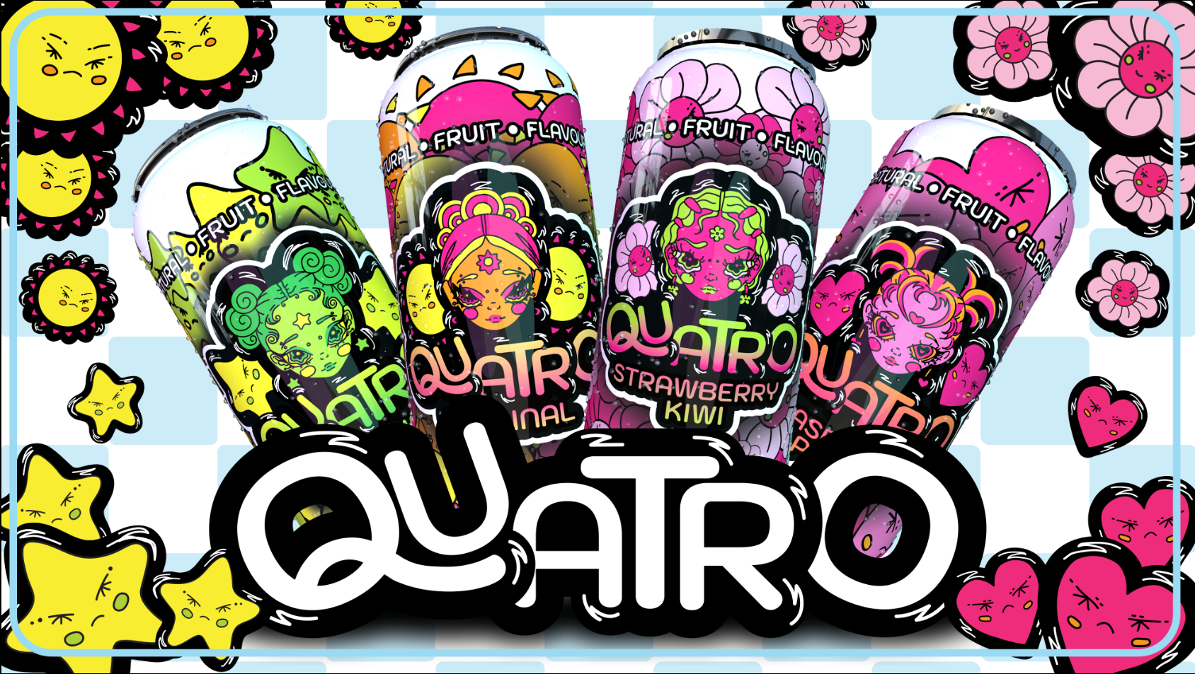
Quatro
This project was a rebranding initiative for school, where I was tasked with reviving an old drink brand to appeal to a younger generation. The project included a fully functional multi-page website, promotional videos, product labeling, and more. I was given full creative freedom, which allowed me to showcase my skills in 2D animation and illustration.
additional infromation
Creating this project was incredibly fun and pushed the boundaries of rebranding. I aimed to capture the excitement of summer and design a vibrant, fun can that would resonate with the target audience. It was an eye-opening experience, as I realized how seamlessly my background as an artist translated into this new field. Working on this project reinforced my love for designing and creating new things for people to enjoy.
For this project, I used Adobe Illustrator, Premiere Pro, After Effects, Cinema 4D, VS Code, and GitHub to bring everything together, from media creation to coding the website. One of the challenges I faced early on was selecting the right background design for the cans. It took a few weeks to find the perfect pattern, as I kept creating new designs whenever something didn’t feel right. In the end, the process paid off, as it helped me discover what worked and what didn’t.


